Graphic Design Student Project
The Client:
Brooklyn Arts Council
The Brief:
'Create a brand identity for this year's Bushwick Block Party'
The Solution:
The focal point for the Block Party identity was a custom typeface. The shapes for the type were derived from architecture around Brooklyn. A layering aesthetic was used to highlight the variety of culture found in Bushwick. The brand's identity focuses on the importance of inclusion and community, people celebrating as one Bushwick family.

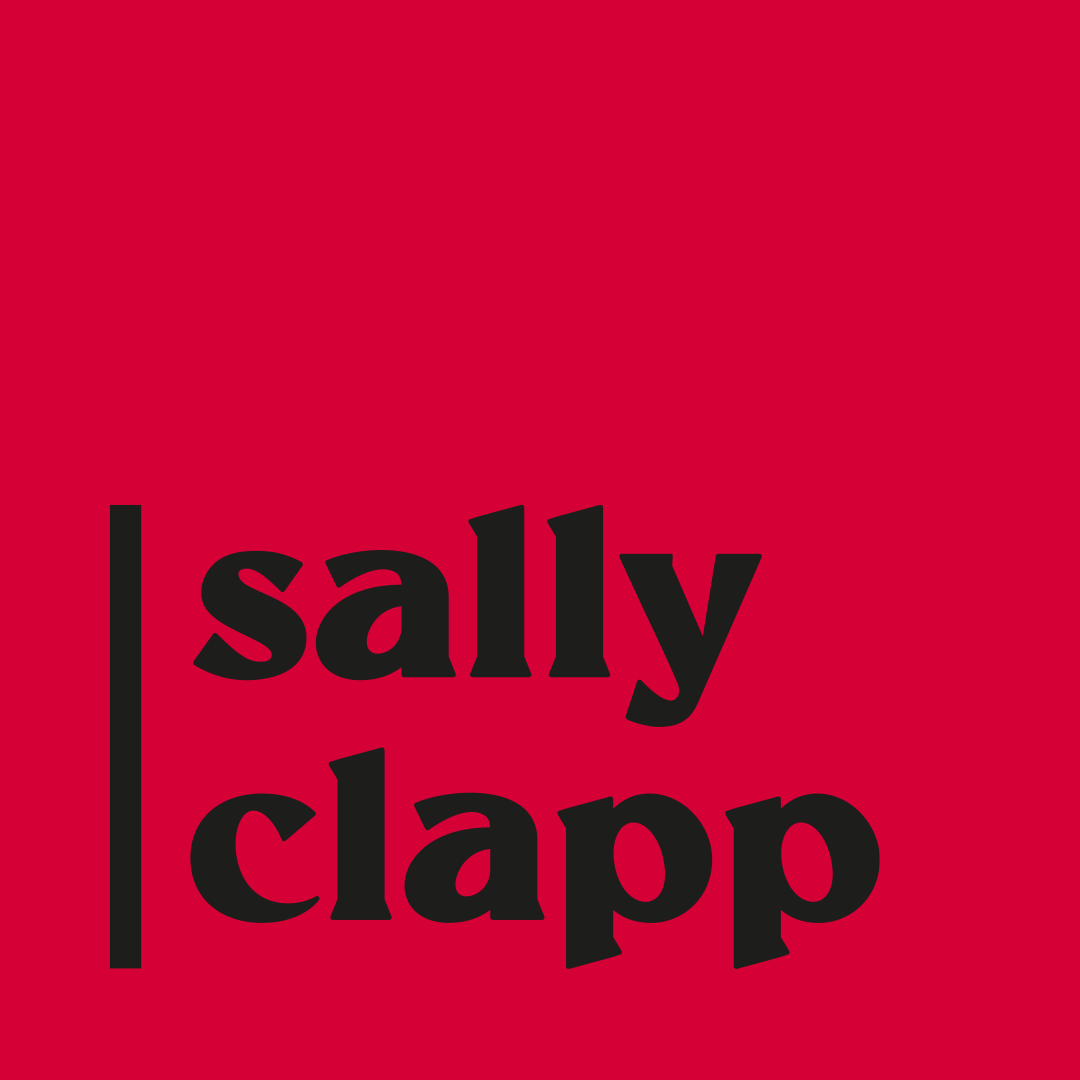
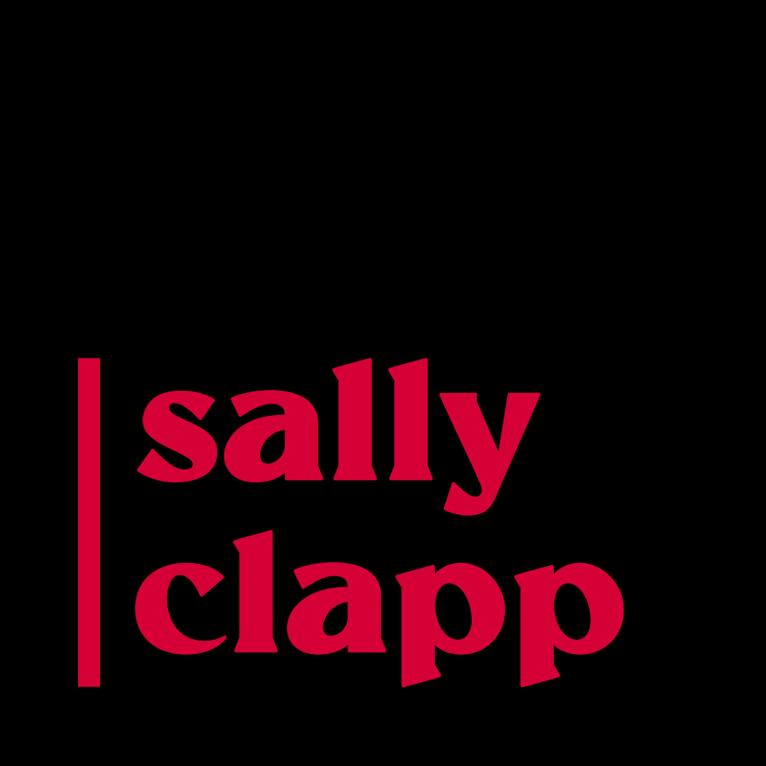
Brooklyn Display Bold
A bespoke typeface for Bushwick Block Party. Inspired by shapes around Brooklyn, NYC.


